

For the last ten years, being “mobile-first” seems to automatically grant a gold star for digital experience designs; after all, more and more content is being presented and consumed on mobile devices. But is it always better to start the design process from a “mobile” point of view?
Benefits and limitations of the mobile-first design approach
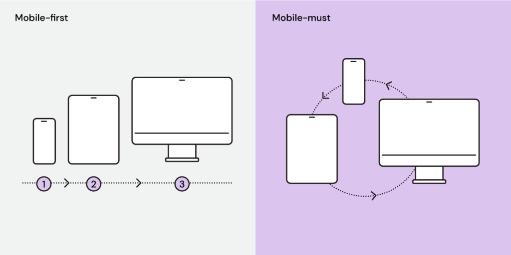
The mobile-first design approach seems to provide an easy angle for designers to tackle interactive and user interface problems. It suggests starting the design process from the smallest canvas and adapting the solution as the size of the canvas grows. Regardless of the challenge, one can basically resort to a tried-and-true format and size it up. If all goes well, one can expect the design to deliver satisfactory experiences on the screen of a wristwatch and a 70-in TV. Piece of cake.
However, in my team’s experience, the mobile-first approach tends to bring more problems than solutions.
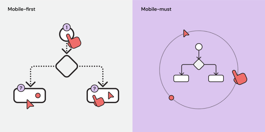
First off, it recommends a sequence for problem-solving that discourages out-of-the-box thinking. Instead of explorations in various directions, it points at a clear path to a solution. That might seem to be an efficient way to get to an answer but psychologically undermines the values of discovery in the design process.
The approach also seems to overemphasize the importance of mobile devices in product experiences. Not every product has to rely on mobile devices. Putting mobile devices first by default could wrongly prioritize what brings value to users. For businesses, too, it can result in directing resources to areas that might not actually matter to customers as much.
Designing first for mobile devices could bring unnecessary noise to cross-platform experience design. The approach introduces the limitations of mobile devices early on in the design process, which adds to problems that designers are trying to solve. The more energy designers spend on “form factors”, the less they have left for the core issues.
________
So how might we address this challenge?
Mobile-must: the better angle
Instead of starting from mobile experiences, a “mobile-must” mentality might be more productive to bring about different cross-platform design solutions.
The mobile-must approach encourages designers to ask more questions. When a product is being offered across devices, it’s crucial to incorporate considerations for user behavior and preferences on different platforms in the design process. Without directing too much effort to the mobile platform, the mobile-must approach simply asks designers to think about what’s important for users on the mobile platform. Maybe typical users are on the go; or maybe mobile devices provide easier authentication – that is not to say that a mobile device has to be at the center of the whole product experience. In that sense, the mobile-must approach removes arbitrary bias to the design process and allows designers to have a more comprehensive grasp of the whole experience.
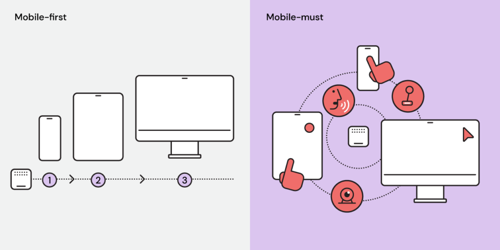
Additionally, being another design prompt, this approach frees up design explorations on various paths. Without specifying any direction, it allows designers to generate ideas and test concepts in various directions and from a multitude of points of interactions – as long as the mobile experience is being considered. For a smart home appliance, who’s to say the user interface has to prioritize a mobile screen? Wouldn’t it be easier for a user to interact with the appliance directly? Why couldn’t the main interface be based on voice? In such scenarios, “mobile-first” is simply limiting possibilities and critical thinking required for innovation.
Furthermore, thinking “mobile-must” puts the emphasis back on the function in a non-obstructive manner as design solutions evolve. This is especially important for in-house design teams building new product features. When iterating a cross-platform product based on user feedback, sometimes it is difficult to prioritize and chart the best course of design action. However, the mobile-must approach injects clarity into the decision-making process with a simple prompt: the new feature is expected to work on mobile devices when needed – meaning “utility-first” above anything else.
________
While mobile devices are at the center of so many product experiences, it doesn’t mean we have to prescribe a certain design sequence with a built-in answer for all. There are bound to be even more different device form factors and screen sizes as we develop more inclusive products and experiences. Since design ultimately is to solve problems, it helps to focus designers while allowing them to explore solutions more freely at the same time.